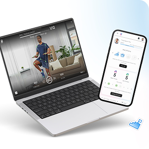
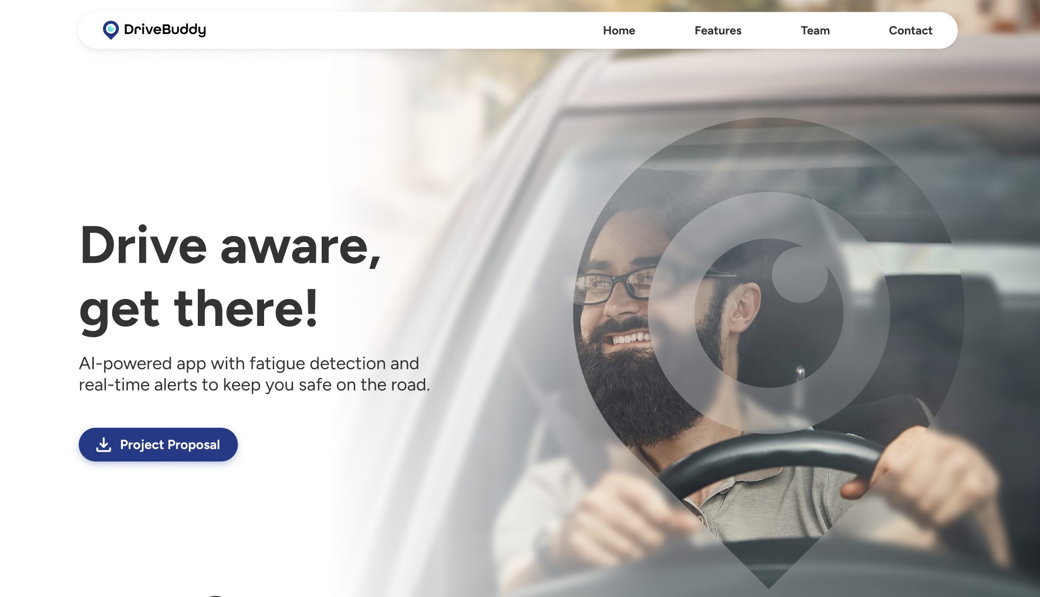
DriveBuddy Landing Page Design
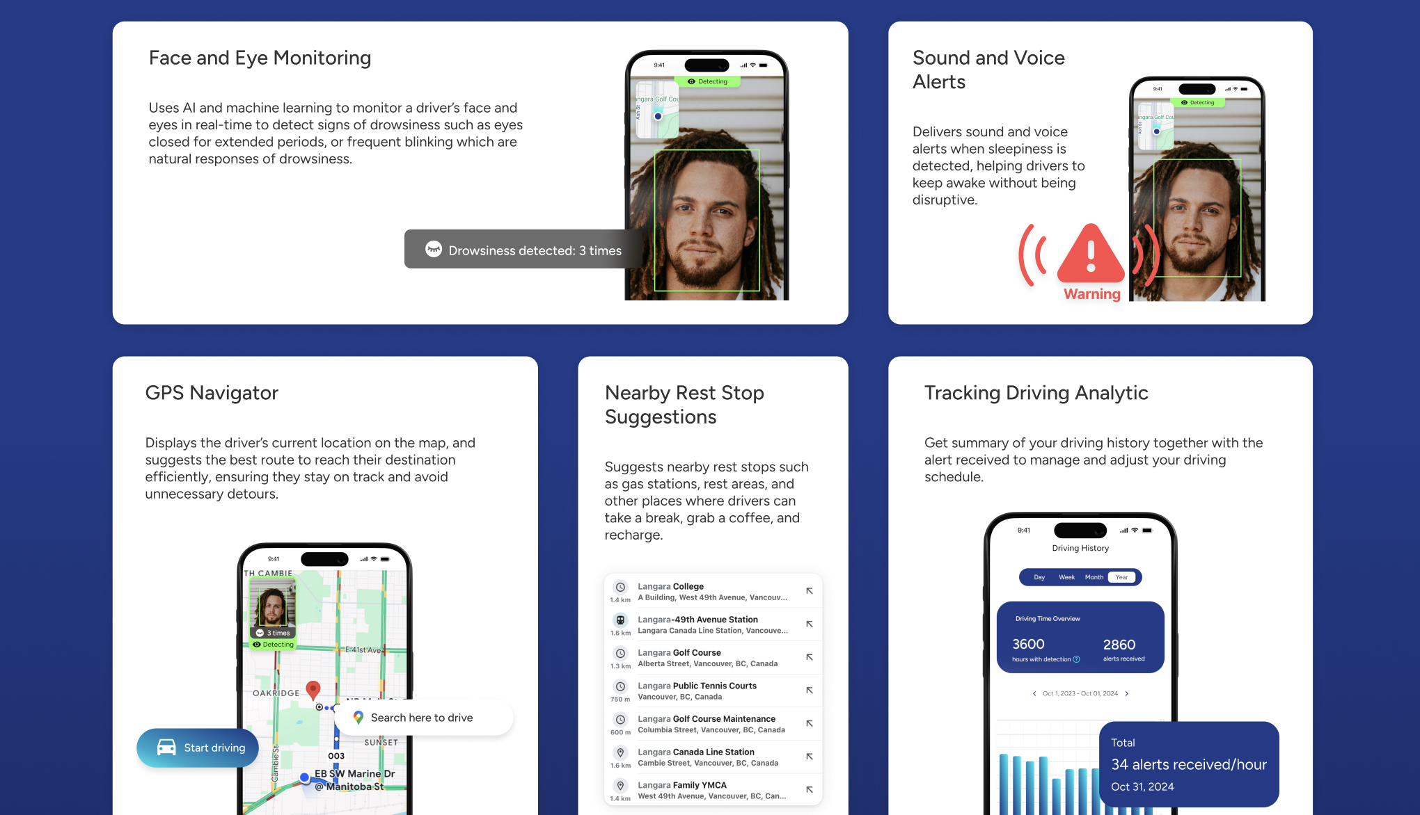
DriveBuddy is an AI-powered mobile app designed to help drivers stay safe by detecting early signs of drowsiness. Face and eye monitoring technology tracks signs like frequent blinking or closed eyes. Instant sound and voice alerts notify drivers when signs of fatigue are detected. Nearby rest stop suggestions encourage timely breaks to recharge. Administrator Dashboard provides real-time insights into driver safety, alerting companies to potential risks before they become incidents.
I created a short teaser to introduce DriveBuddy
It is a group project and I was design lead, as well as UI/UX designer working together with 4 other designers and 3 developers. I take on the task to design a landing page for DriveBuddy. Designing the DriveBuddy landing page began with thinking and organizing the information I want user to see. Before touching any UI elements, I mapped out how a visitor should feel as they scroll - curious at the start, informed in the middle, and confident by the end. This early stage helped me build a structure that felt clear, calm, and purposeful.
Once the structure and content of the landing page was set, I moved into visual design. I refined the layout, typography, and spacing to create a rhythm that’s clear and follow branding of the app:
Safety • Reliability • Ease of use
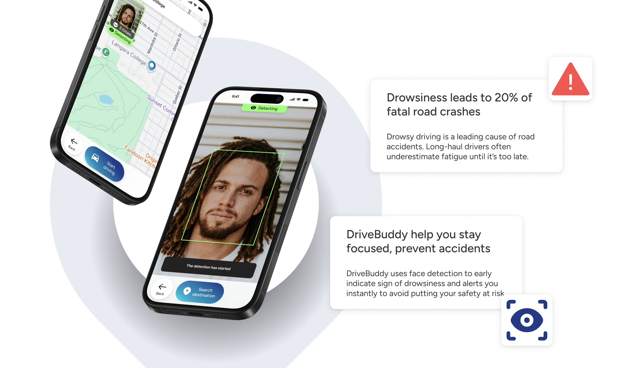
With the visuals in place, I shifted to making the website fully responsive. I designed and tested layouts across a range of screen sizes-from wide desktop views to small mobile screens-to ensure everything stayed cohesive and intuitive. By the end, the landing page felt consistent everywhere: a simple, friendly, and well-structured introduction crafted through thoughtful iteration and attention to detail.
Design responsive website on any screensize
Check out the live DriveBuddy landing page here
DriveBuddy landing page